While this is the final product of my Creative Project 1 for GIT384 during my fall semester in 2024, let me take you through the creative steps I took to get here.
Here was my original idea concept for a poster: a creative promotional poster for Billie Eilish's new album, Hit Me Hard and Soft.

I found the red photo from a google search and it was in incredibly high resolution (yay!) so I subject masked Billie's body to be in front of the large text to get more ideas. However, I didn't like how her body fully covers "SOFT" and most of the context to "TOUR" so I moved onto the next idea: The same thing slightly moved with more stark contrast.
This album's original cover has a very navy, dark blue overall theme and I wanted to incorporate that from the get go, so here I thought I could try. I also fixed her body being "doubled" because I didn't catch that in the other idea trial.
The same text issue persists. While now I have more color for more interest of contrast, I still felt there was a lot missing. The next attempt now has texture and a richer blue hue, but I wasn't satisfied and if anything was getting more upset despite liking the grunge tone now in place.
If at first you don't succeed, rearrange your subject to be more in frame and pop out the words more. I mean, what?
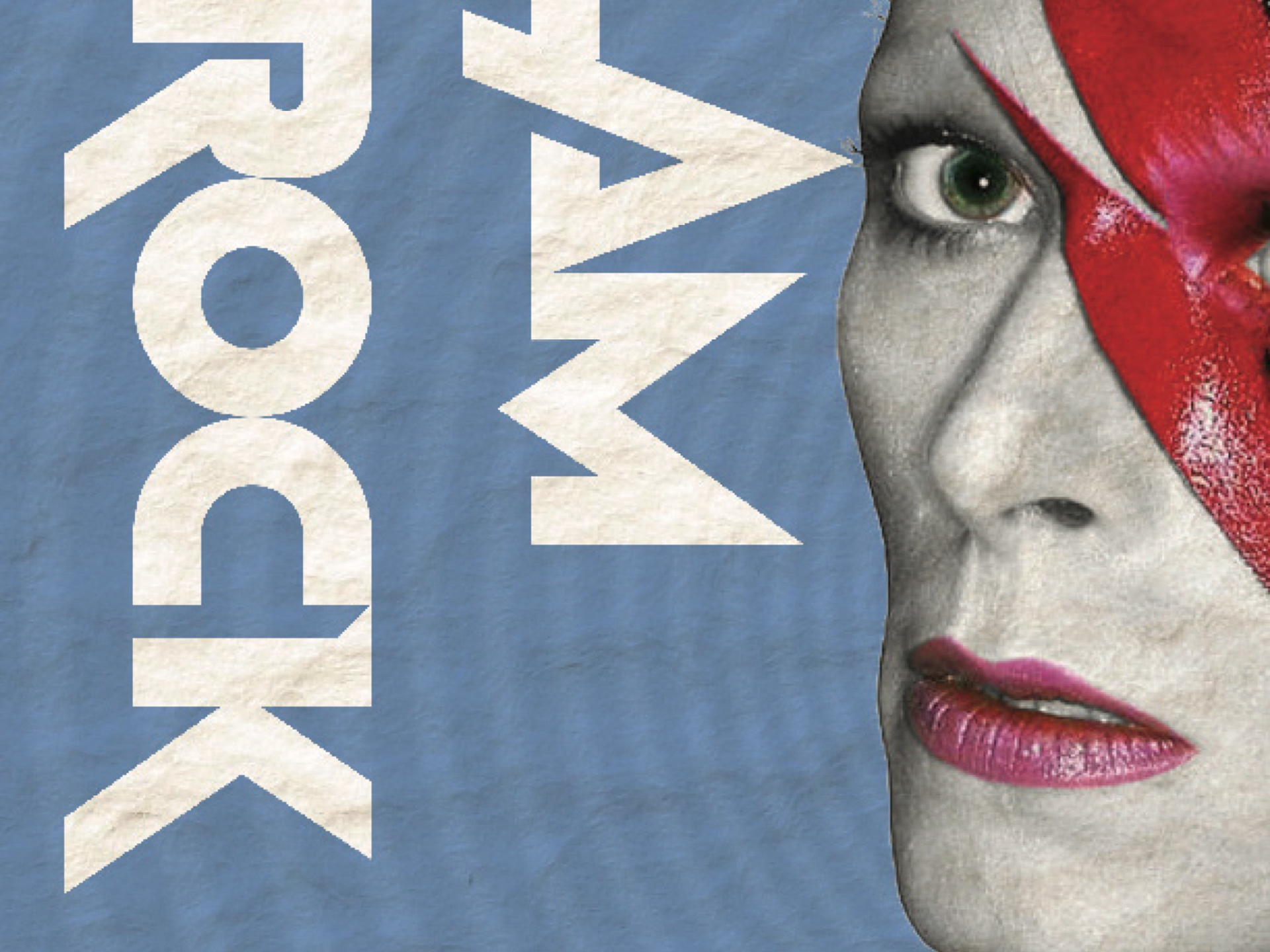
Ok, so I got a little stumped. I still loved the full paged lettering of the album, so sue me. So in another attempt to get my original vision, I moved Billie over to the right and cut off a lot of her body to fit the negative spacing of the words better. I also switched to bright white so it could cut through the red unlike the transparent original.
It felt like I was getting somewhere now, but at the same time, I feel like I'm missing so much. Not just for the requirements behind this poster for the class assignment needs (because I for sure was missing a lot to reach that too) but generally as a whole. The main question that came from this was: If someone doesn't know Billie Eilish, why whould this mean anything to them?
So to address this issue, I decided putting in more info was key. I added the artist, and context that this tour was not happening but soon to come in this year.
Changing the background was also to satisfy my internal need to have her original album cover's deep blue theme in, while still hanging onto the cool rich red I couldn't let go of (as well as liking her outline in black) and still it isn't good enough.
Finally, I decided to do something about the pressing issue: the title span had to go.
Condensing the words to not span the page makes more room for more info, where I added her songs from the album, but also makes it less overbearing. While I kind of wanted overbearing, I felt I was losing the general audience more in the text being so large than helping them visually enjoy and understand the poster.
Happy? Well, not really. So, add layers of cool effects!
Here is the final again of what I landed on, where I addded a transparent/white gradient layer as the "shine" to make it look like it's coated paper poster, I made the blue bluer both by hue and that gradient layer to keep it's contrast by color to red rather than it being washed out in a deeper navy, and I dialed back the texture effect to have the song titles pop out more while also softening the overall look for a good feel. I also made the bits of blue lower for the effect of it not being so gradient washed of a lot of different blues so I could keep the viewers from gradient strain (might not be real, but it is to my eyes.)
In the end, I really am happy with my design choices and proud of this work. In reflection, I feel like I should have tested more photo options or gotten more ideation of compilations of photos to use rather than just one, or generally had a better poster vision from the get go but I was so blank. Anyway, thank you for seeing my work!
